menu close

vitrum amsterdam

view

vitrum amsterdam 

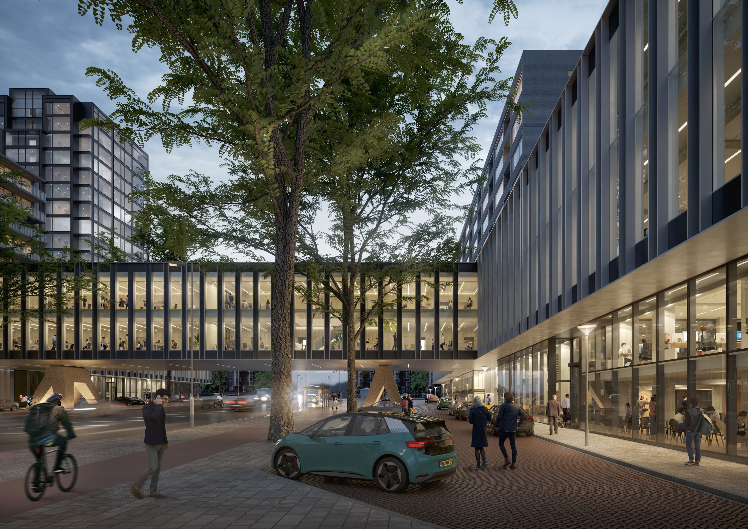
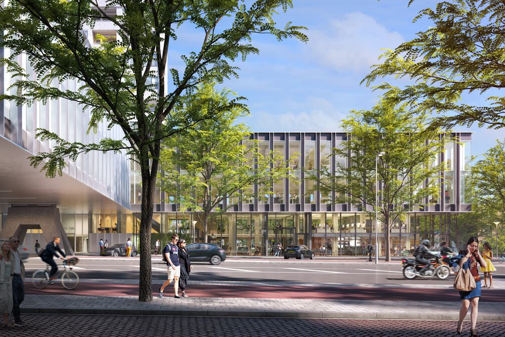
The Vitrum office building with housing is a monumental, post-war gatehouse built in 1966. The most striking element is the harsh concrete bridge construction spanning the Parnassusweg. However, in the course of time, the once striking façade consisting of square and rectangular elements, lost its coherence due to multiple changes. Thus, cepezed created a renovation design that does justice to the original design while still delivering a completely new building.
  • client(s)
  • nsi
  • location
  • amsterdam
  • user(s)
  • companies
  • expertise
  • architects
    cepezed interior
  • project brochure

Increase sustainability  

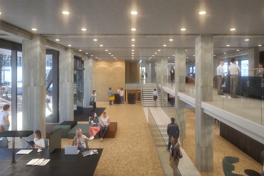
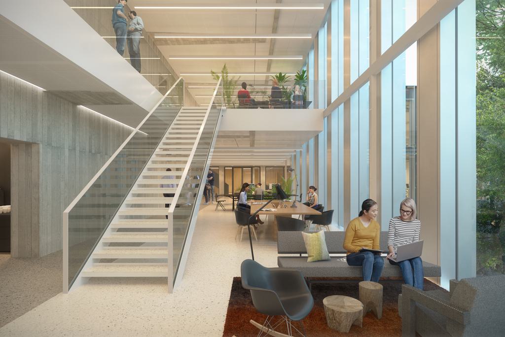
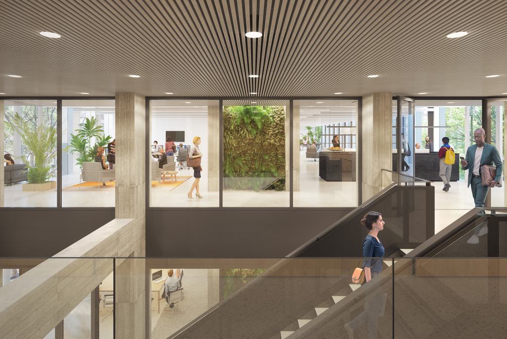
The development applies only to the office part in the 4 lower floors, meaning the bridge and the long, low building parts on both sides of the street. The apartments are in the towers on the 2 end sides of the building. To make the office part more sustainable, increase the possibilities of use and restore cohesion, cepezed proposes a different spatial layout, complete with some passages. By opening up the plinth facades, the ground floor becomes usable as office space. Due to the low storey height, voids are created at the new entrances. This creates spatial connections with the office floors above.

padding  

Without disturbing the proportions, cepezed also opts for volume expansion: the existing construction allows for 'thickening' by more than one and a half metres on all sides. For the required extra square metres of office space, this is a much more subtle solution than the expansion in a compact volume. Moreover, and not insignificantly, it offers the opportunity for radical sustainability and engineering improvements. In one fell swoop, the new facades are up to date, pipe routes can be easily dragged and we avoid complicated cut-outs in the original concrete construction.

maximum transparency  

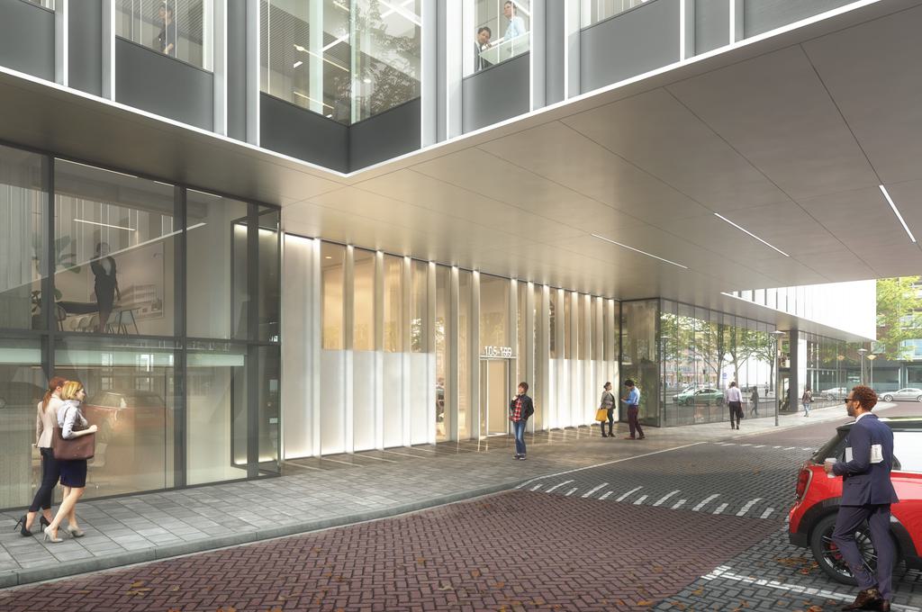
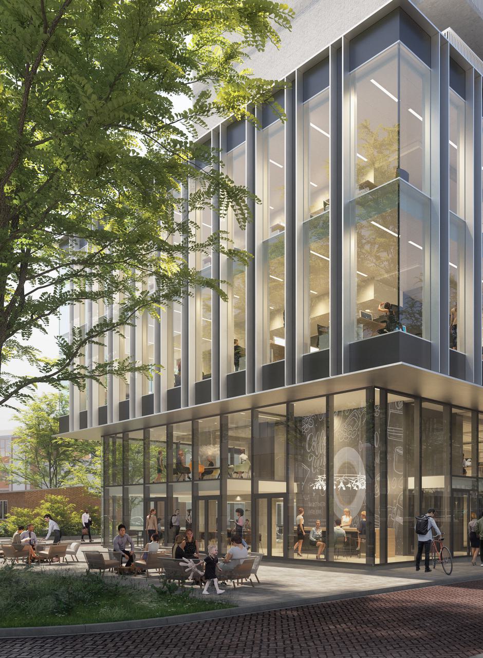
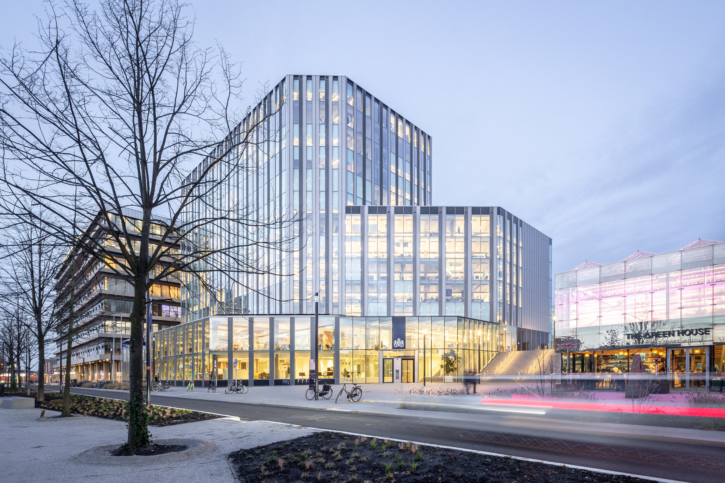
We are restoring the original threefold division of the ensemble: the set-back plinth, the H-plan on the third and fourth floors and the dwellings in the brick and concrete 'towers'. The plinth along Parnassusweg will be maximally transparent, the superstructure more closed; these facades will feature vertical aluminium 'fins'. Thanks to the large amount of glass, what happens inside is visible from the outside, as well as the construction of the building. Thus, the 1960s concrete vibe remains present.

tactile quality  

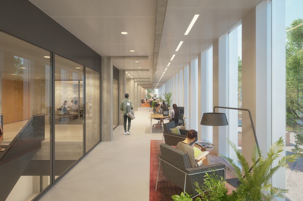
The fine tactile quality of the concrete structure becomes most tangible at the former access corridor, in the middle of the bridge. Here, the finish of the concrete is stripped, revealing the imprint of the formwork. Because of the structural function of this concrete, nothing else will change, but the existing openings and the former corridor will be used for functions such as pantries and toilets. The new access including the points of ascent will be in the wide zones along the facades, which are much brighter and easier to navigate.

City street concept  

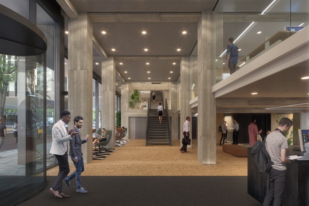
The spacious and light office lobbies are much more appealing than in the previous situation, and with a more open plinth, cepezed connects to the 'city street concept' that the City of Amsterdam formulated for Parnassusweg. Besides the new entrances for the offices, space is created on the ground floor for yet to be determined functions. At the southwest corner of the complex, there is room for (daytime) catering with a pleasant south-facing terrace.

partners

  • client: nsi
  • projectmanagement: CBRE
  • construction consultant: Zonneveld ingenieurs
  • MEP design: Hiensch engineering
  • cost calculation: TwynstraGudde
contact
→ Mail bd@cepezed.nl or call our business development team on +31 (0)15 2150000